Home / Categories / General
Why does my page look fine on desktop and broken on mobile?
A page breaks on mobile because the phone layout is a separate view. Click the mobile icon at the top of the editor and work there. Settings marked with a mobile icon change that view alone.
Why the two layouts differ at all
Pages are made of sections, with rows and columns inside them. Three columns sitting side by side across a laptop have nowhere to go on a phone, so systeme.io stacks them vertically instead.
When a page looks wrong on a phone, that stacking is where to look first. Nothing has gone missing. It has gone underneath.
The switch you are looking for
At the top of the editor there is a mobile icon. Clicking it moves you into the mobile view, and systeme.io states that editing there does not affect the desktop version.
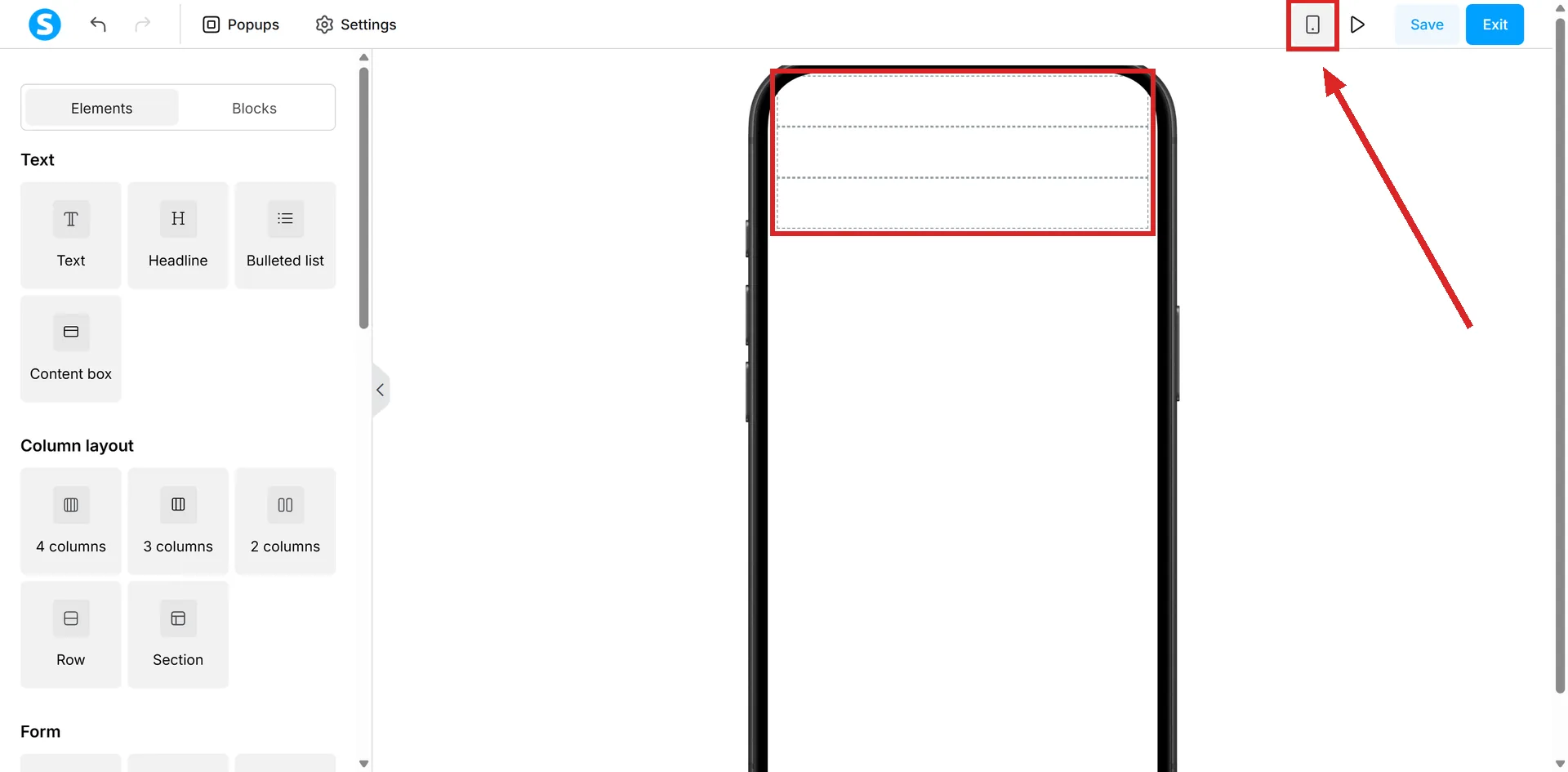
Inside that view, any setting marked with a mobile icon of its own applies to mobile only.
The three settings that fix most of it
- Item visible on. Checkboxes for Desktop and Mobile, so an element can be shown on one and hidden on the other.
- Disable vertically stacking rows on mobile devices. Leave it unchecked and columns stack one above the other. Tick it and they stay side by side.
- Reverse row columns on mobile devices. Flips the stacking order, which is what you want when the image lands above the text it belongs to.
Checking before anyone else sees it
While editing, the preview toolbar at the top right switches between Desktop view, Mobile portrait view and Mobile landscape view.
The one thing preview will not show you
Raw HTML does not render in Preview mode. It appears only on the live page. A layout that collapses around a Raw HTML block will therefore look correct right up until you publish it.
How I checked this answer
Nothing on this site is written from memory. These are the sources I checked to write this answer, and the date I checked them.
- How to fix the mobile version of my pagehelp.systeme.io, article 270
- How to create a custom page using systeme.iohelp.systeme.io, article 168
- How to create a websitehelp.systeme.io, article 4526
- Is it possible to insert HTML, CSS, or JS code?help.systeme.io, article 306
Checked on
Did this answer your question?
Keep reading
- Can I use systeme.io without knowing any code? Yes. The nearest you get is pasting somebody else's tracking snippet into a box.
- What is a subdomain, and do I need one? Every account already has one. Connecting your own follows a different guide from a whole domain.
- Do I need a registered business to take payments? systeme.io does not ask. The payment gateway does, and one of its answers is individual.